Dashboard Home screen
You can use the Dashboard Home screen for a fast and easy analysis of your company data. This feature is supported by Power BI®, which provides easy filtering, navigation and highlighting of data. Using easy to use drill-down filters, you can compare different parts of your business.
On the Dashboard Home screen (under the Dashboard tab in the left toolbar), you can see:
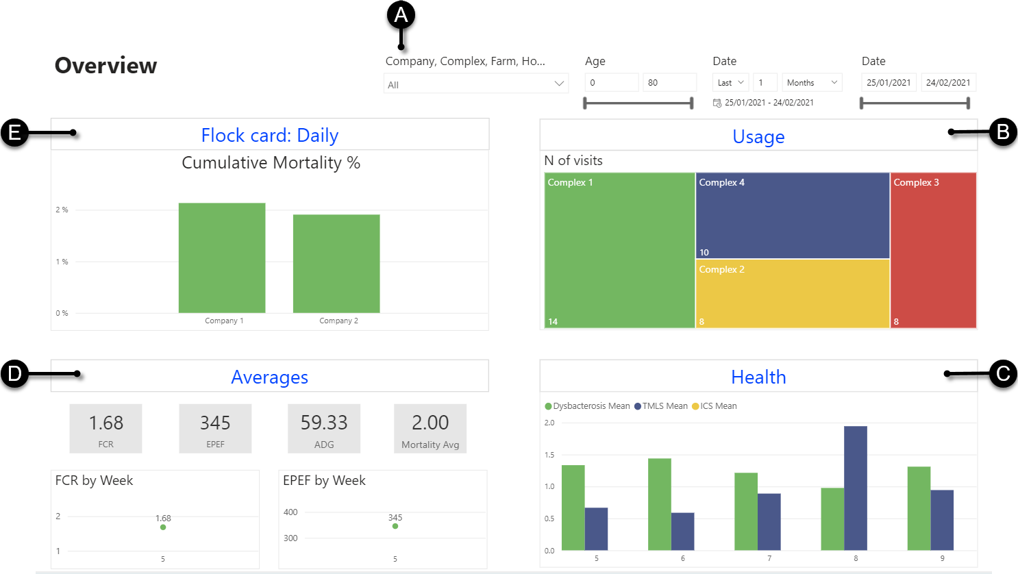
- A
- Filters (see Filter charts using the dashboard filters)
- B
- The Usage dashboard, which gives an overview of the monitoring frequency in the Client (see Usage dashboard screen). This dashboard is for Admins only.
- C
- The Health dashboard, to follow up the health monitoring results of your company (see Health dashboard screen).
- D
- The Flock results dashboard, to follow up the end results of the flocks in your company (see Averages dashboard screen).
- E
- The Flock card daily dashboard, to follow up the daily performance data of your company (see Flock Card: Daily dashboard screen).
Tip: You can hover over the bars of the charts to view the corresponding values.
Note: If the left toolbar is invisible, select  in the upper-left corner of the screen.
in the upper-left corner of the screen.