Usage dashboard screen
The Usage dashboard visualizes the visits of users. You can access the Usage details screen by clicking the Usage heading on the Dashboard Home screen.
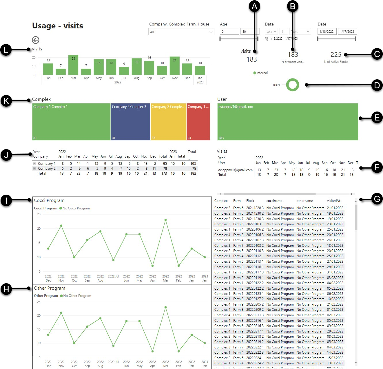
- A
- Number of visits
- B
- Number of flocks visited
- C
- Number of active flocks
- D
- Doughnut chart of the percentage of Huvepharma and internal visits
- E
- Treemap of the number of visits per user
- F
- Table of the number of visits per user
- G
- Table of all number of visits
- H
- Line chart of the number of visits per month for other programs
- I
- Line chart of the number of visits per month for cocci programs
- J
- Table of the number of visits per company
- K
- Treemap of the number of visits per complex
- L
- Bar chart of the number of visits per month
You can filter the charts on:
- Parts of your company: see Filter charts by company parts
- Age range: see Filter charts by age
- A particular period and optionally an exact date: see Filter charts by date
Tip: You can hover over the bars of the charts to view the corresponding values.